Branding and Identity / Graphic Design / Package Design
Adele "25" Album Campaign
Rethinking the branding and identity for the artist, Adele
This was a self-initiated branding challenge to see if I could re-imagine the artist Adele's presence in the music industry. Her existing brand at the time didn't truly seem in alignment with her actual identity as an artist. While her music is largely characterized by powerful, emotional, slow ballads and intense vocals, her brand seem to present a funky, edgy, pop-like identity. For her latest album at the time of this project's inception titled "25", I wanted to challenge that brand and create something much more authentic. The combination of color palette, typefaces, and textures chosen together represent the fiery passion and depth found in Adele's lyrics, while also presenting her poise, grace, and class. It also encapsulates her more classical and acoustic sounds that have mostly avoided the use of synths or electronic instruments.
What did I do?
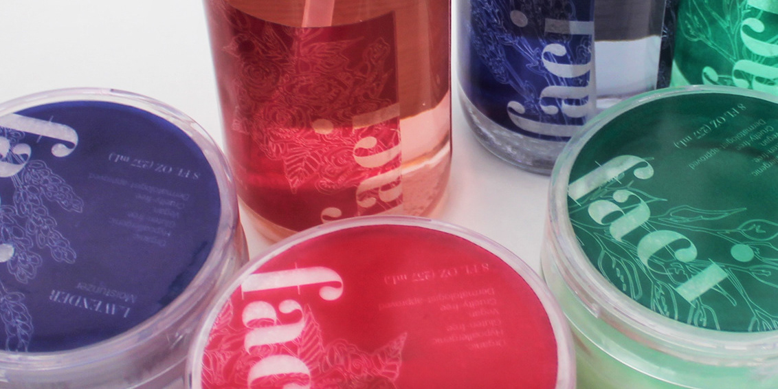
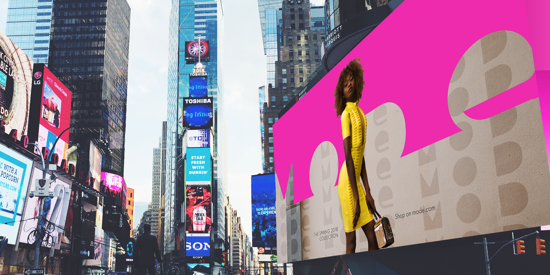
Develop logo concept and system, create color schemes, design marketing materials (CD sleeves, billboards, website, and iTunes pages), design and print and build physical CD cases and decals for disks
What tools an software did I use?
Adobe Photoshop, Adobe Illustrator, Adobe XD, CD Printing
